The signs of writing in architecture In contemporary cities, looking at the signs of writing is one of the first and the strongest human experiences. Celina Bukowy
The omnipresent letters, digits, words arranged in complicated visual systems still mainly play the informative function. More and more often we encounter the new role of these signs. One hundred years after the revolution in architecture and typography, which effectively ripped it off ornaments, the situation paradoxically changes where the typography becomes one of the most preferably applied decorative motives in architecture.
Inscriptions, proper names of buildings in an extended form serve not only to provide information and visual identification, building the prestige of the company or institution but the decorative role becomes equally important. The usage of scaled letters often determines the look of the entire block of the building.
The inscription “MoMA” placed on the roof of a storehouse adapted for the department of Modern Museum of Art in New York allows an unambiguous identification of the object from a far distance. The inscription designed by Michael Maltzan is composed of big white spaces attached to different technical devices on the roof in a way that they create a visible inscription from only one place for the observer.
The glass façade of the monumental cuboid of the Modern Museum of Art LENTOS in the Austrian Linz (design of the Swiss office Weber + Hofer), placed on concrete walls as a thin shell, is all covered with little printed text, legible only from really close. Big but unusually discrete inscription “LENTOS” create a place which is not overprinted. The name of the museum is a negative on the façade covered with an ornament of inscriptions.
An interesting stylistic hook was applied by the Dutch office Neutelings Riedijk while designing a different university building, the seat of the Department of Earth Science,s Physics and Astronomy in Utrecht. The proper name of the building MINNAERT is composed of letters of the size of the lower floor which plays here the constructive role - they are columns. Deep arcades behind the inscription reveal the parking lot for bikes and they emphasize the spacious character of the simple cut of letters. A bright and light text contrasts with the ashy elevation of the ochre colour.
Another building of the same office, a printing house Veenman in the Ede in Netherlands, is entirely packed in letters which builds one text, a poem of a Dutch poet, K. Schippers (Gerard Stigter), but it’s not considered a message. Evenly placed net of black letters do not stack up in words but composes a group of loose signs.
Marcin Brzezicki, in his work on the role of typographic signs on elevations, writes about the moment when the text loses its semantic value: “When spaces between letters exceed the ones to which the recipients are used to in a typical text, the content of words stops being intuitively legible. […] Regular multiplexing usually leads to rhythm creation with keeping a certain distance to the creation of ornament.” (1) In case of the printing house establishment, we can talk about a metaphor. The letters reveal the building’s function as a place where letters are “produced”.
If architecture needs mechanisms allowing its connection with culture, then indeed it is difficult to find more literality than reference to texts excerpts on buildings directly attached to art. An enormous inscription cut out in a copper wall of the auditorium Wales Millenium Center in Cardiff is a bilingual poem of a Welsh poet Gwyneth Lewis, specially written for this building - In these stones, Horizons Sing. Architect Jonathan Adams admits that the „idea of this monumental inscription has been taken from the Ancient architecture of Rome.” (2) Karl Jenkins composed Requiem for a choir and orchestra to this phrase. A piece performed only once at the day of the opening of the center, 4 October 2004. The separate letters of the inscription have been glassed and they light the interior. The same letters seen after the dusk are lit outside the building. If we assume, according to Zenon Fajfer, that the visual side of literature is as equally important as the plot and the style, and the “work might be transformed into anything and be made of any material,” we can talk about a certain form of liberature; »Liberature«, i.e. the architecture of a word. Architecture which is the most spacious arts of spacious ones. [1] (3)
The writing signs or the entire excerpts of texts turned out to be an unusually lightsome element applied on buildings of libraries. The letter ornament in a way decodifies their destiny. The most famous new building in Poland is the University of Warsaw Library. On the curved green wall, under the monumental inscription, “University of Warsaw Library”, the architect Marek Budzyński and Zbigniew Badowski put eight boards with texts in different languages, among others the excerpts of Wykład Cnoty / Lecture on Virtue by Jan Kochanowski, the fragment of Book of Ezekiel in Hebrew, Arabic, Sanskrit, in Old Russian and Greek. The ornamental functions can be also found in the texts placed on the building of the Urban Public Library in Opole by the design of the Opole Office Architop. The historicizing facade was juxtaposed with a simple form of two walls separated by narrow lanes of glass. The pewter rectangles of the walls like sheets of paper were “overprinted” by texts of poetry of Edward Stachura in English and in Polish. The dense text is illegible from a further distance; the level of writing corresponds with the ductile rustication of the nineteenth century tenement next door.
The Royal Library of Alexandria in Egypt, one of the most prominent realizations of world architecture of the recent decades is hidden behind an enormous stony façade covered with letters of the languages of the whole world what was supposed to tribute to the mythical Ancient library in Alexandria. The Europeans interpret the signs of Arabic writing as an ornament. The building project was born in the Norwegian office Sannes. It is also the author of a different exceptional typographic masterpiece designed for the teacher’s House (Lærernes Hus) in Oslo. The decorative glass façade is covered with transformed letters and signs, which apart from the ornamental function has a practical function. They regulate the light influx, resulting in the regulation of heat in the building. Additionally, on sunny days ornament “moves” inside: the shades of letters create a ductile pattern on a raw concrete of the staircase. (4)
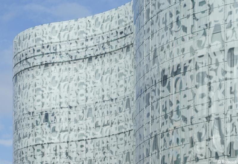
In 2004, the Brandenburg University of Technology in Cottbus was established. It was designed by a famous duet Herzog & de Meuron. The glass façade of a seven ground building covered is by signs overlapping on each other. Its legibility has been totally blurred and they became a transparent net of ornament. A big oval block of the building is thus exceptionally decorative.
The glass with the overprinted splays was applied also in the successful revaluation of the modernistic complex from the 60 s, Haus der Presse in Dresden. On the existing façade, there was a glass coat put on. The fragmentariness of the overprinted glass caused that its reception stays an experience uniquely esthetic. (5)
The diffusion of lettering as an ornament undoubtedly has a strong connection. On one hand with a very popular architectural application of glass facades, on the other hand with an advanced technique of printing which allows transferring complicated decorations on the glass. The writing signs as an ornament appear popularly not only on very prestigious and expensive realizations but they have popularly been accepted in utilitarian art and they can be seen on regular balcony glasses.
A novelty in the contemporary space is giving priority to typography, changing its function from informative to purely esthetic, and making it the most important ductile means of formation. The work practically composed only of text is the pavilion of the Christian Garden in the park World’s Gardens in the Eastern part of Berlin Marzahn. It was inspired by Medieval monastic gardens. “Cloisters” encompassing the regular square garden is a freestanding typographic installation of which walls are created by a transparent construction of letters constituting the text of the Old and New Testament. The letters designed by the Berlin artist, Alexander Branczyk, were made by a painted in gold aluminum. The work is supposed to recall that Christianity based on the culture of words, books and writing. In the history of architecture, it is not a quite new situation. Covering entire fragments of walls with calligraphy is a traditional ornamental motive in the art of Islam. The missing wall can be an innovation though.
The tribute given to typography and arduous traditional printer-compositor’s work, impressive in its assumptions and its execution is the project of the British square of the artist Gordon Young. The monumental “square to be read” also called Comedy Carpet is a part of the revitalization project of the sea town Blackpool. It consists of inscriptions of different sizes, texts of 1000 British comedy writers. All of these 160 thousand letters were cut out of granite and were arranged with pinpoint accuracy in blocks inundated with concrete. Gordon Young is an artist who obsessively uses typography in his projects. His Typographic trees at the Crawley Library, Wall of wishes at Bristol Brunel Academy and numerous pavements covered with inscriptions prove how popular the inscriptions devoid of meaning in space have become.
The cult of modernism deprived us of consciousness of ornament and interrupted the tradition of many centuries of craft which kept it alive. Today ornament starts to be accepted again. Its return in a form of typographic patterns of letters, words and texts seems to be a sort of a comfortable compromise between radical “Less is more” of modernists and the postmodernist “Less is bore” by Robert Venturi who dangerously brought us close to the esthetics of kitsch. Supposedly in the name of purity, clarity and other twentieth century commandments, we contest decoration but we would willingly accept its “minimalistic” printing version.
We could reflect on, along with Radosław Nowakowski: “Why did we set our minds on letters? […] Nothing but only letters and letters.” Nowakowski responds himself: “We are the Civilization of Words. Names. Labels. We expect that words will explain everything. We think that things can’t exist without words. We believe in the power of words. Let’s imagine that it is sufficient to give something a name, stick a label and we understand it immediately.“ (nie ma 6 przypisu). And even if we don’t understand, and even if the golden inscription on the building gate leading to the Wawel court „SI DEUS NOBISCUM QUIS CONTRA NOS” has lost his power in praising the mightiness of royal dynasties and for the majority remains only an ornament, a beautiful renaissance antiqua, we feel safe and the look of letters has a soothing effect for us.
(1) M. Brzezicki, Znak drukarski jako ornament, raport na prawach rękopisu, Politechnika Wrocławska, Wydział Architektury, Wrocław 2007, p. 39.
(2) Quotation: M. Brzezicki, op. cit., p. 24.
(3) Z. Fajfer, Liberatura czyli literatura totalna. Teksty zebrane z lat 1999–2009, Ha!art, Kraków 2010.
(4) See: M. Karpińska, Harmonia elementów, centrum konferencyjne i szkoleniowe Larernes Hus, „Architektura & Biznes” 2010, no 12.
(5) See M. Brzezicki, Haus der Presse – nowy biurowiec „second hand’”, „Świat Szkła” 2007, no 12.
Celina Bukowy (born in 1971) – a graduate of Art History at the Jagellionian University in Krakow. She studied at the University in Hamburg and Joke Smith College in Amsterdam. She publishes, among others, in “Architektura & Biznes”. Currently, she cooperates with the gallery Strefa A in Krakow.
-
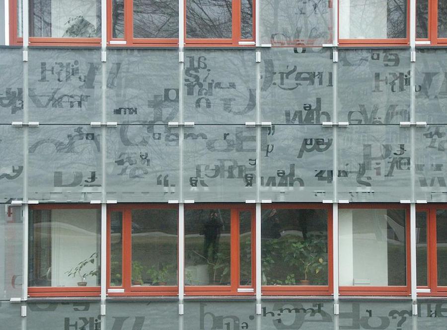 Haus der Presse building in Dresdno, phot. M. Brzezicki
-
 Department of Earth Sciences Minnaert in Utrecht, proj. Neutelings Riedijk phot. C. Bukowy
-
 Library of the Brandenburg University of Technology in Cottbus phot. M. Brzezicki