Painting the words An interview with Paweł Susid about typography, art and pop culture – Zofia Kerneder and Anna Sulich - Liga.
ANNA SULICH – LIGA: What inspires you: a word or an image?
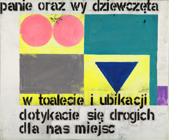
Paweł Susid: Over the years, it changed. Today, I am motivated to paint by a sentence or a thought. I am pretty lazy, expedient; I like to lie down, read. I used to wake up with some funny or serious word or a sentence. Or I came up with a great idea in the morning, while jogging. I left home sleepy and I came back with an image or an idea for a painting. Sometimes, it was also a provocative sign or symbol. Such was the case of the national signs of women's and men's lavatory, to which I added text: "Ladies and you girls, in bathroom and the lavatory you touch places that that are dear to us." To one of the paintings of Strzemiński, I only added "Two fine girls". Looking at this picture, I clearly saw a profile of a woman, so I just wanted to supplement the form created by the painter. Similarly, one of the Crosses of Kazimierz Malewicz appeared to me as something similar, so I just added "The design of table for 4 persons."
ZOFIA KERNEDER: When did a first image with text appear in your works?
It was already in the first year of my studies, in Tadeusz Dominik’s studio, in 1973. I was slogging to paint a nude and a small picture was made. You see, I didn’t really like it, because in the bottom of the painting I added “A Girl from Home”, which was already the first step in this direction. So I can say that it came along with professional studies. Then, I painted some other strange things, for example "patterns" of fruit and vegetables, but I already signed them using a template. It was a time when I painted on large formats a sort of comic storytelling. I was also interested in the earlier art that used captions: folk woodcuts, luboks (1), the early stages of British, and then American, comic art. Finally, the windows ROSTA(2) form October Revolution and the War of 1920 made a huge impression on me.
I studied and grew up at a time when art began to be "difficult". I remember such exhibitions as, for example, the exhibition at the Modern Gallery: there was a piece of something on the wall, and six sheets of A4 paper with a description; I was losing patience to read it. Then, it helped me to realize that by using a language, words, I was holding a conversation with the viewers, and I can help them to get in touch with my paintings ... At the beginning it was very important for me to communicate with the viewers, to help them have "access" to my work. Even on some images I intentionally teased them with so-called average taste ... but I wanted to cooperate with the viewers and I wanted to be understood. The previously mentioned image Both fine Girls can serve as an example. It was apparently an erotic and procreative subject, but there was Strzemiński hidden in it... so, the history of art and the possibility of any interpretation.
ASL: What is a decisive factor that a text appears in the painting?
Sometimes it is the elegance of language; sometimes anachronism that is important, or other things. I repeatedly made various attempts to use words in my paintings. There were some very short captions, for example, "entrance" and "exit". The entrance was illustrated in the shape of the vagina entrance, symbolizing the coming to this word of each of us. An “exit” was represented as a "star" of an anus, what clearly demonstrates my lack of faith in any afterlife. We came into this world through mother's womb, and we will leave not that far from it. Maybe it has some meaning? I wanted to have a work on that subject.
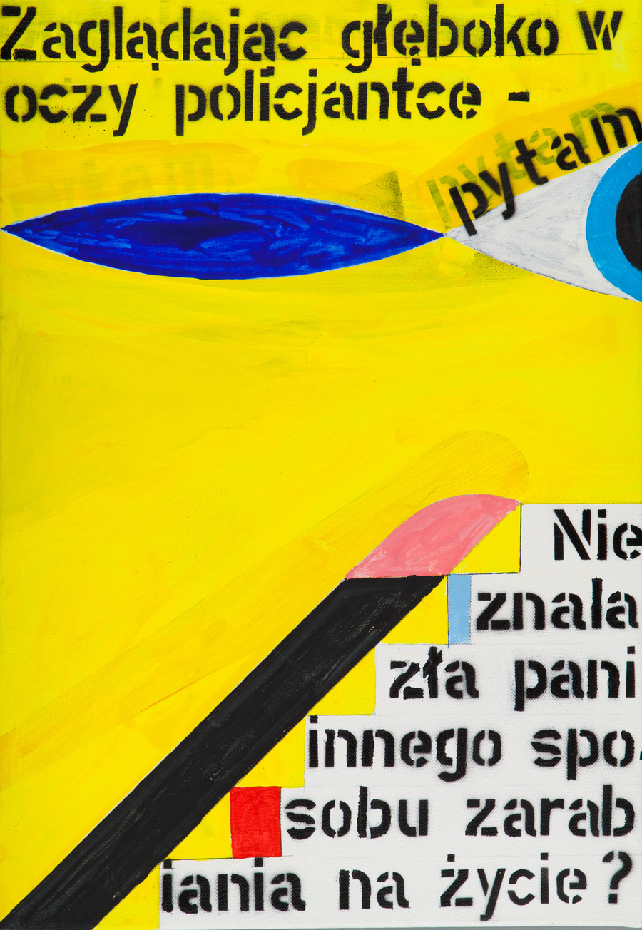
There are also the paintings in which I tell stories. In MOCAK collection there is a picture of the female police officer. I paid a fine in a park because there was a half-empty bottle of beer on the bench next to me. I was reading a book and I opened a beer. And here comes a situation full of contradictions: a beautiful woman within the context of oppressiveness of law...
Sometimes I feared the so-called journalism, reference to the current events. It seems, however, that the introduction of news to paintings makes the image the document of a given age. I think that artistic creativity is a reflection of the social situation, civilization development, and specific events. It is not possible to be cut off from the reality that is around us. Art is not able to jump out of it ... On the paintings there are stories of my adolescence, experiences, changes that I witnessed, or at least I believed such was the aim of my work.
ZK: You are the author of the majority of texts appearing on paintings, but in your works there are also series of painted borrowings - where do they come from and why did you choose them?
Once, for example, I was impressed by a text of Wacław Niżyński from his memoirs written during his thirty-year stay in a psychiatric hospital. I really wanted to paint his words, those a little bit crazy. So I came up with the idea of a colorful alphabet: I used colors for letters. For some time I was experimenting, I made several paintings with different sentences. Each time when I chose colors, I created different alphabets and made different sentences. Niżyński’s attitude impressed me. There is a danger of falling into madness; it always poses a threat to those who are fervent artists. It seemed to me that those colors became of a great significance. They were intertwined with the language of a madman, a wonderful artist, a dancer ...
However, the main part of my work is constituted by issues and impressions of my own life; but it also happens that I undertake political topics. In any case, it seemed to me in the past, that the meanings assigned to words, slogans and ideas were often, if not always, exaggerated. I started to paint known catchwords, names and slogans, putting them into patterns. "God honor homeland", "Liberté, Egalité, Fraternité", "Proletarians of all countries, unite", "CCCP", "USA", "Gott mit uns", "In God we trust"... All of them brought strong emotions at a time, they even cost the lives of millions of people, but in different times they lost their power. It seemed to me that we are unable to understand this phenomenon, and that is why we risk similar mistakes. In my projects I multiplied those names and catchwords; I also had an idea of covering with them a ship on the Vistula River, or other large item. People would look at the already discredited words and perhaps would avoid some future tragedies. However, reality is different. Currently, we carefully remove words, images, and even monuments. We keep on replacing them with the new ones, whose humiliations cannot be remembered by the living generations. In this way, the experiences of our ancestors fall into oblivion. This phenomenon of forgetting or not-inheriting of knowledge and experiences of our predecessors has probably a fundamental meaning to our fate.
ZK: Where, do you think, is the place of painting today and what role does it play?
It seems to me that at the beginning of the twentieth century the traditional nineteenth-century painting has lost its former place in the new homes. Today, the screens, photographs, prints, and even notes dominate on the walls. If all of these products of modern technology can be used in a contemporary setting, then we need to look for new places for the paintings. I have already hung some of my paintings in the bathroom and toilet, in hallways, above the cash, low or high, everywhere where they performed its functions. I wanted the image to be bumped into, to be a provocation for a change of ideas. This is, I presume, my post-conceptual experience. Conceptualism helped me to reflect upon the function of the painting, the shape of the canvas and its place.
ASL: The texts painted with the use of a template with a specific font are a regular characteristic of your work. Why do you use this template? Is the shape and color of it important?
The template was taken from a shop in Sweden, from a shipping company. A long time ago I ordered an electric gun to paint, which was of no use; but in addition I got several sets of templates. At that time, I used them for my "comic paintings". This “anonymity" of a template seemed interesting to me, but the usage of it, after all, is also a signal ... After all, I started to like it… I was pondering over capitalization and “composing” the templates within my painting; captions are usually black, but sometimes, when I sit long enough over something, I also consider the usage of colors. The matter of color appears in the painting process.
And now back to the first question. What does inspire me more: the content, image or form? Perhaps my attitude to the template indicates that what I care about is only the subject, content and story. It even happened that I sat in front of several canvases of various formats and I painted the same theme on all of them, and later I chose the best one. After a while, I discovered the others and was not able to find what I disliked in them previously. My work Ladies and you girls, in bathroom and the lavatory you touch the places that are dear to us I also painted simultaneously on two canvases. Both of them were on display in Zachęta. The idea was to show that it is purely an artistic exercise to a given text. I can paint something even twice, if the painting is nice. You can paint a picture for the second time, because the role of the handcraft in painting has long since changed. I am not looking for forms in the painting. I rather hope that I can find the functional and acceptable forms by chance.
ASL: What is the difference between painting images with your own texts and with those borrowed?
In case of painting catchwords and slogans I intervene only by placing the color bar or only a rhythm. Then, I withdraw a little bit of taking artistic decisions, choosing colors depending on the meaning of words. The colorful alphabet that I already mentioned, or changing colors of borrowed words, serves me to take a closer look at them. I count on getting what I want by chance. It is a sort of a play and the final result sometimes surprises me.
ZK: Apart from painting, is there some other combination of image and words that you like?
I mentioned some of them earlier. I really like art that requires intellectual effort, and these often combine a thought, word, and image.
(1) Łubok - Russian folk artwork, mostly woodcut, the content of which were often folk tales; text and images were connected in it.
(2) ROSTA Windows, ROSTA Windows satire - propaganda graphics of Russian Telegraph Agency from the years 1919-1921, made with the use of the templates, often satirical and referring to folk aesthetics.
Paweł Susid (born in 1952) – a painter, illustrator, designer and teacher. He graduated from the Academy of Fine Arts in Warsaw in painting. In the years 1984-1992, he ran the Youth Gallery at “Bielany” International Press and Books Club (KMPIK) in Warsaw. Since 2009, he is an assistant professor at his alma mater in the painting studio at the Faculty of Media Art and Stage Design. The artist also served as a juror in various competitions, including Samsung Art Master. His works were presented on numerous national and international exhibitions. Paweł Susid’s works are in collections of the most important cultural institutions in Poland.
-
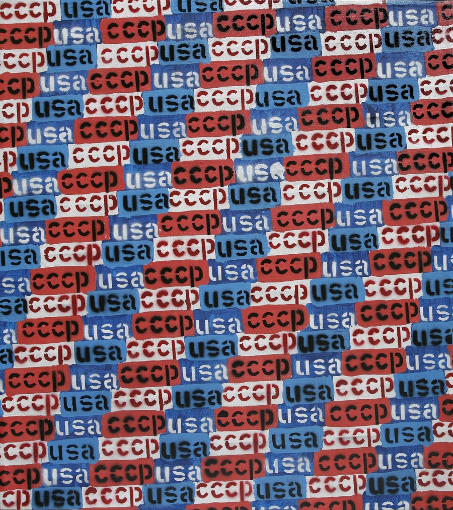 Paweł Susid, CCCP, USA, from the series Predicting by repeating/ Przewidywanie przez powtarzanie, 2010, acrylic / canvas. Courtesy of the artist.
-
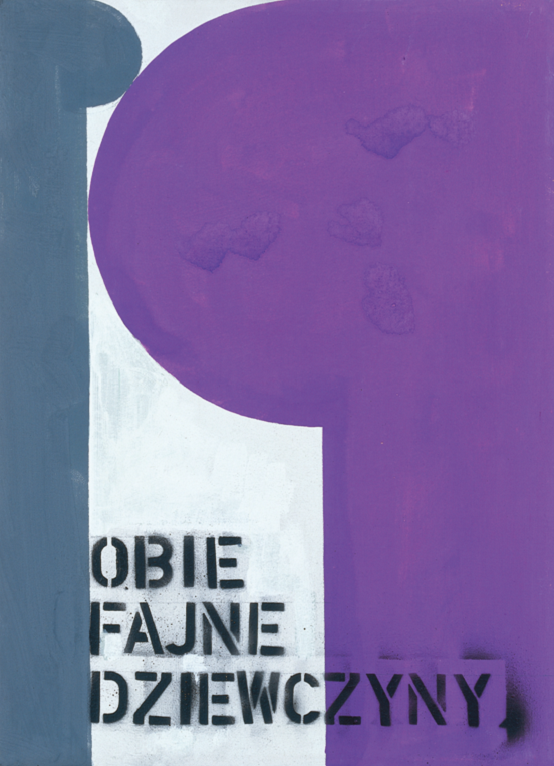 Paweł Susid, Both fine girls, 1992, acrylic / canvas. Courtesy of the artist.
-
 Paweł Susid, untitled, 1998, MOCAK Collection, acrylic / canvas, phot. R. Sosin
-
 Paweł Susid, untitled, 1998, MOCAK Collection, acrylic / canvas, phot. R. Sosin
-
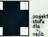 Paweł Susid, The design of table for 4 persons, 1985, acrylic /canvas. Courtesy of the artist.
-
 Paweł Susid, CCCP, USA, from the series Predicting by repeating/ Przewidywanie przez powtarzanie, 2010, acrylic / canvas. Courtesy of the artist.